I've started another charm (5") square project, this time a bigger version of the Becharmed quilt.
Since having guests last week, I've decided it's high time I make a quilt for the guest bed. Normally, one of my kid's crashes there for the occasional stay, and the bed is usually covered with minky blankets. Both blankets have a Seminole style design on them, with one beige, the other red. Let's just say they don't fit the decor of the room.
I've been wanting a quilt for this bed for a long time, but couldn't decide on a pattern. I did know I wanted it to be subtle and fit with the room, not be the focus of the room.
The room is painted in a greyed beige and a purple-ish deep blue, colors that were pulled from the very large picture on the wall. Yes, we've had it for many, many years, and hubby likes it there.
So, my first fabric pull was non-yellow/gold beiges, and purple-y blues, with some that had a bit of aqua in them.
All fine and good, but the level of contrast is sky high! I want this quilt subtle, not screaming "Look at me!"
Pulling out the super dark blues and replacing them with blues that where lighter and brighter was better, but still too much contrast existed.
How about lighter blues instead of the beiges?? And staring me in the face in the bin was a large piece with circles on it:
Now we're talking! The contrast is down, the colors blend into the room, and I'm going to see if I can make this work!
It will be tricky, as the circle fabric has a chunk missing, but I'm going to try anyway. Maybe the quilt won't be as big as I want, but at least it will look better than those minky blankets!
And in case your wondering, that tree on the wall is a vinyl tree decal (affiliate link), and one of six. They are taupe in color, and on this wall, the tree looks beige, while the other five on the opposite beige wall, look grey. Super simple to decorate with!

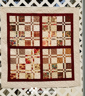
Last week, I showed you Lickety-Split Two, and today it's about her twin sister, Lickety-Split One.
This one is just as pretty, with the same floral prints as Lickety-Split Two but with deep red charms from yardage instead of cream.
Notice that this one doesn't have any sashing. I was really loving the overall deep red theme going, and didn't feel that sashing was necessary.
But just like her sister, she has a border that's 3 1/4" wide, matching the squares in the blocks.
Overall, she measures 38" x 38", a bit smaller than Lickety-Split Two.
No issues here with a large enough backing fabric - it's all one piece.
Doesn't that quilting just look lovely?? That's another favorite pantograph, Bluster, with Glide Purple Rose thread too.
So, let's see the sisters side by side.
 |
| Lickety-Split One |
|
 |
| Lickety-Split Two |
|
I'd say these two are fraternal twins, wouldn't you? Turned out to be a pretty good experiment, splitting the floral charms and combining one with cream and one with deep red. Love seeing the effect of different values, making for two similar but different quilts.
And that wraps up the Lickety-Split quilts from the Charm School book (affiliate link). Not sure what I'll work on next - I'll let you know Wednesday.
Thanks for stopping by and Happy Quilting!
The quilting is done, binding is on, and now to show
Lickety-Split Two.
Remember this pretty assortment of charm squares?
Half of them went into the above quilt, and the other half into another. I decided to divide the floral charms, and use half with the cream charms on the right, and the other half with the dark red yardage on the bottom.
The result is two similar, yet different quilts - figured it might be more fun that way! The other quilt I'll show next week, but for now, it's all about Lickety-Split Two.
Measuring in at 42" x 42", she kinda follows the Lickety-Split pattern in the Charm School book (affiliate link).
Sure, she has the disappearing 4-patch blocks (which, by the way, I wasn't too fond of making with 5" squares). She also has sashing, though it's not the same width or with the setting squares that the pattern has.
Instead, I opted to make the sashing the same width as the center block parts, which is 1 1/2". Personally, I think the smaller width just works better for the smaller quilt.
Notice that I also used the backside of the cream charm squares again, just like in Sea Glass. Another brilliant move!
Oh! And look - I put a border on! A lot of my quilts don't have borders (don't ask me why), and it does add a nice touch here.
It's width also matches the squares in the block, at 3 1/4".
With all of that in mind, here's your quilt design tip for the day:
Use the elements of repetition and uniformity.
By repeating or using multipliers of block units, a quilt will have a cohesive feel and not be a jumbled mess. This little nugget has helped me countless times in quilt design!
So let's move on to the quilting:
I could have done some semi-custom work, with different fills in the blocks, sashing, and border. But after assembling the blocks, I have to admit, I was kinda done.
Easy Peasy to the rescue!!
One of my all-time favorite pantographs, this little quilt looks great, especially in Glide's Purple Rose thread.
And let's not forget the back! Since I needed a bit more backing fabric, I used the remaining floral charm squares in the back, where they look just as pretty as the front!
Overall, an adorable quilt!
Thanks for visiting today, and come back next week to see Lickety-Split One.
Happy Quilting!